Unifying Invoke AI: Building a Single Home for a Thriving Community
Table of Contents
Backstory
Invoke AI is an open-source image generation application built around the idea of letting the user stay in control of the visual direction of their results. There are already tons of self-hosted options that do largely the same things, but where Invoke shines is with its Photoshop-like Canvas tool and a UI built by real designers.
Invoke started as a small project on GitHub by Lincoln Stein, a Canadian cancer researcher who dabbles in LLMs and image generation technology on the side. After a few major releases, it began to gain traction from an audience of AI hobbyists who were growing tired of the poorly designed, Gradio-based UIs of similar tools. Invoke was a breath of fresh air and featured a layout philosophy that maximized the center “working area” of the application.
Following a few more major releases, the core team expanded—eventually monetizing the project with a hosted version for enterprises or individuals who lacked the hardware to run certain models on their own machines. Now equipped with a source of revenue, the core team was able to focus on Invoke full-time, shipping even more ambitious updates and innovations while keeping the non-hosted Community Edition free for all users.
In late 2025, Adobe recognized the core team’s potential and—with their AI ambitions aligned—recruited the group to lead Adobe’s AI division. Consequently, the Invoke enterprise edition was discontinued, shutting off further development funding.
Myself, along with the Invoke community at large, were devastated. The “big bad” had come in to poach a great team and the funding needed to keep its winning streak going. Fortunately, they left the Community Edition intact, stripping out some enterprise-related code in a later commit.
The Fallout
The community sentiment quickly coalesced around a grim consensus: Invoke is dead. A feeling of an unsure future permeated across communities on Reddit, Discord, Twitter, and several AI-related blogs. Updates slowed down significantly.
Making a Comeback
A small group of contributors wasn’t done with Invoke, however. They still loved using the tool, wanted it to evolve, and refused to let a lack of funding or sour community sentiment get to them. It was at this time that Lincoln rounded up a new core team of volunteers to lead the future of the Community Edition Invoke.
New developer meetings kicked off, new goals were defined—and with that, Invoke’s community development resumed.
Their Website Landscape
Invoke’s official online presence had been fragmented for some time, a problem compounded by having support, docs, and the homepage scattered across different domains and hosting providers.
Our Solution
As a longtime contributor myself, I felt a massive service could be done by unifying everything into one place: a docs site that seamlessly integrated support, troubleshooting pages, and a stellar homepage. Beyond that, we felt the ecosystem could use even more features:
- Reorganized pages
- An auto-generated
llms.txtfile - A single docs sidebar for everything
- Auto-populated release pages
- Interactive docs sections
- Stronger SEO
- And much, much more…
We got to work with a tech stack that fit the bill perfectly: Astro, paired with the Starlight documentation framework. This stack provided all the tools necessary to build an easily maintainable and accessible docs site that could automatically publish new versions of itself as new releases went live.
Implementation Strategy
We like to work safe. We created a new branch of Invoke, renamed docs to docs-old, and then created a fresh Astro Starlight project directory aptly named docs. From there, we began the massive task of translating all 80+ Markdown pages to use the new, much more flexible Starlight formatting. Along the way, we made updates, additions, and removals to craft the most coherent, streamlined experience possible.
Aligning the Design Language
The Invoke application features a clean, dark color palette. It uses its primary “Invoke Yellow” very conservatively (mostly just for the logo), while “Invoke Blue” does most of the talking. The application itself has a very professional feel, featuring slightly rounded corners, smart usage of surfaces, and a neat background grid pattern in applicable places (like nodes and the canvas) to convey scale.
Building the Homepage
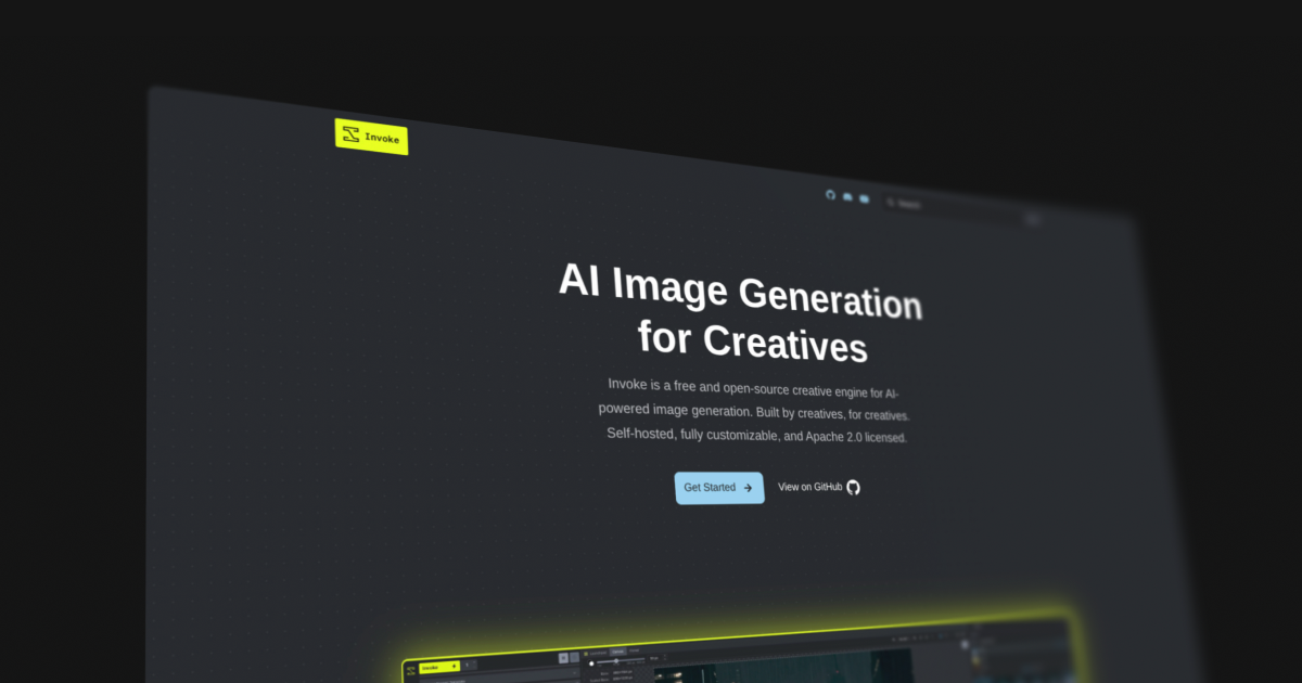
The previous official homepage and support site had gone all-in on the yellow, using a “light mode” color palette and sharp corners that shared very little DNA with the actual application. We wanted to correct this by matching the aesthetic of the app almost exactly, while still allowing the website to feel like its own entity.
We reused the signature headline, “AI Image Generation for Creatives,” and prominently featured a preview of the application’s most powerful asset: the canvas.
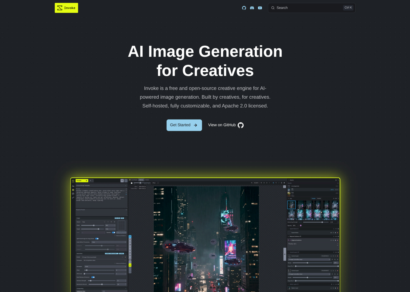
There’s a cool, subtle dots grid that doesn’t come through well on a screenshot of this size, so you’ll just have to trust that it’s not as simple as it looks here, haha.
Reorganizing
We worked to streamline the docs in a few key ways:
- Efficient separation of concerns
- A smooth beginner-to-expert reading flow
To achieve that smooth reading flow, the most beginner-friendly pages were placed at the forefront for easy access, with further reading naturally progressing into more advanced territory. This philosophy guided how we approached both the individual pages and the broader grouping of the documentation.
Broken Links
Naturally, when reorganizing 80+ pages of documentation, we were bound to run into broken internal links. If one page links to another but the target has moved—boom, broken link. Multiply that by the total page count (plus a conservative average of 8 links per page) and we had the potential for an absolute nightmare of future “oops, forgot this link” commits.
To mitigate this, we implemented a link-check test. Whenever this command was run, it would crawl the internal links and notify us of any that led to a 404 error.
Transitioning to MDX
Markdown is great, but MDX is even better. It allows us to render React and other Astro components directly inside the Markdown files. The natural result is the capability to create highly interactive, engaging pages that effectively demonstrate the concepts being documented.
Our strategy was to handle this page-by-page. Where applicable, we used our IDE tools to auto-replace common formatting with the new Starlight syntax.
For example, tips would previously be formatted as:
!!! tip "Tip Here"

    Content here
And now they all would get formatted to:
:::tip[Tip Here]
Content here
:::
We like closing tags :)
Dynamic API Content
If you thought reformatting 80 pages, untangling broken links, and restructuring the site architecture was the biggest hurdle—you’d be right, but mostly just because of the sheer tedium.
However, there was a technical challenge: the old docs site cleverly injected context into the Markdown during build time to dynamically render entire APIs on a page. This capability needed to exist in the new site. Since Astro and MDX don’t handle this natively, but do excel at rendering NodeJS components, we engineered a solution. We wrote a new build script that extracts the relevant APIs, exports them to JSON files within a new generated folder, references their contents within an Astro component, and renders them dynamically on the page.
Huzzah! We still have dynamically rendered API documentation, albeit with a few large auto-generated files living in the project now.
LLMS.txt
A new standard gaining serious traction across the web is the /llms.txt route, which renders a site’s documentation in a plain-text format specifically designed for Large Language Models. This has quickly become the preferred way for LLMs to parse website information, as it prevents input tokens from being wasted on DOM elements that don’t contribute to the actual meaning of the text. I’d be lying if I said this was a difficult addition—it was already available as an out-of-the-box Starlight plugin.
Launch Strategy
Once the new docs site was in a good spot, we felt it was best to continue using the invoke.ai domain rather than an auto-generated GitHub Pages URL. We worked with Lincoln and the old core team (who still held ownership of the domain) to get it configured for GitHub Pages.
We also felt it was long overdue to rethink the deployment method, transitioning away from using an isolated branch and simply deploying directly from the docs directory.
Anticipating old SEO
We anticipated that Google would hold onto search listings for the old docs site for a while. Since GitHub Pages doesn’t offer the SSR environment required to set up efficient redirects, we had to resort to manual takedowns of old links. Thankfully, this became an easy—if slightly tedious—process:
- Search Invoke topics
- Click the 3 Dots
- Click “Remove Result”
- Click “It’s Outdated and I want to request a refresh”
The most you can do after that is sit and wait for our Google overlords to grant the requests—which, fortunately, they did.
The Future of Invoke
With Invoke heading in a new and exciting direction, it was only right to kick things off on the right foot with a new docs site and homepage. It’s a testament to the project’s transition from merely surviving to actively thriving. Invoke is now seeing new contributors and PRs every single day, bringing support for new models, bug fixes, and exciting ideas.
I’ll be continuing to contribute to Invoke alongside this incredible ragtag gang of devs. If you’ve ever been curious about having a locally hosted AI image generation creative suite, we highly recommend giving Invoke AI a try! ;)
Rebuilding Invoke’s web presence wasn’t just an exercise in styling—it was an exercise in information architecture. Managing 80+ pages of highly technical documentation, creating custom build scripts for dynamic API injections, and mitigating SEO fallout requires a sturdy foundation and a whole lot of forethought.
Need a site that can handle a lot of pages? Let’s talk.